Sunday, December 13, 2015

Time Out for Sketching

Vase of dead flowers, sketch from life
I have all but finished quilting the Turtle Spirit quilt I have been posting about most recently. I had to put it away when a multitude of guests came to town last month. Fortunately, I only have a tiny area of quilting to finish, and then I can bind it and start on the next one pinned to my working wall.

Now it's December, and the holidays are once again upon us. My father-in-law died just before Thanksgiving. While it was a sad occasion to lose this wonderful man, he was 91, and had lost his quality of life. The funeral and Thanksgiving feast turned out to be an extended and joyous family occasion, a rare time when all were able to be together. I am truly thankful.

I am also so grateful for my weekly artist group. In the midst of all the difficulties life has to throw at me, my weekly meetings with Gail and Jill are a godsend. I cannot recommend more strongly setting aside time each week to meet with like-minded people, no matter your passions. The synergy created in a well-curated group is magical and, while there is never any pressure to do or make anything in our group, I always want to have something I am making progress on or something new to show. It keeps me on task the rest of the week.
Poppies in my garden, sketch from photo

That said, with all the eldercare in the last months before my father-in-law died, I haven't had a lot of time to make art. Sketching does not take a lot of time or preparation. Yet, I haven't succeeded in recent years in making it a daily practice.

Two of my artist friends, Susan Shie and Jill Milenski, are inspirational in their sketching practice, and I am motivated to return to that level of fluency. For her birthday, Jill got our friend Gail the book Art Before Breakfast by Danny Gregory. Gail, who had never drawn at all until last year, literally drew her breakfast, which she shared as her "homework" during our last get-together. It is a wonderful book for anyone who thinks they can't draw. Gail is getting fabulous results, and her latent talent for drawing is emerging,

At our last get-together, I had my sketchbook and tried some different drawing tools. Jill had some book-sale books with lovely photos to draw from, so I picked one, and went at it. It only takes a minute. It's a practice I want to make a daily one in the coming months.
Reference photo for sketch
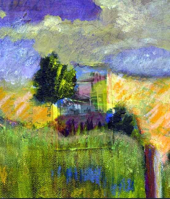
Italian Doorway, sketch from photo


Tuesday, November 10, 2015

A Way With Line: Quilting


Turtle Spirit is quilted with standard quilting thread
as well as perle cotton and embroidery floss.
By Gayle Pritchard, 2015.
Fiber artists are a rare breed in the fine art world. They are often asked why they work in fiber vs. painting on canvas. I have one answer to that question: the quilting line.

As an element of art, line and implied line play a crucial role as a building block of any composition. In an art quilt composition, unlike a painting (unless you are Robert Rauschen-berg), you have an additional layer of line to consider. The quilting line as stitch is functional; it literally holds the layers of the quilt sandwich together. As the layers are quilted, a shallow relief forms, creating slight contrast on the surface with line and shadow. As a compositional element, this shadowed relief adds a layer to the composition that is missing in painting and other flat media. Quilts are not quite sculptural, but they are not flat, either, and this is why I love to make them.

This second layer of line should be a planned part of a finished fiber composition. The quilt top can be finished and still be completely transformed by the manner in which line is applied in the form of quilting to finish the piece.
In Turtle Spirit, for example, you can see how the grid formed by the quilted line, executed here by hand with perle cotton and a darning needle, constrasts with the circular pattern of the underlying African fabric used for the side panels.

Grids of lines run across grids and circles;
tufts of embroidery floss change the color and
texture of the underlying fabric

As in any artwork, the line created by quilting leads the viewer's eye around the composition, creating emphasis and contrast. Additionally, it can be used to flatten areas, causing them to recede visually while simultaneously drawing attention to the adjacent area. I have spent my career playing with these contrasts, and I love it still.

Sunday, November 8, 2015

Basting an Art Quilt

Turtle Spirit layered with backing &
batting: it's ready to baste!
I'll admit it here and now: I'm old school when it comes to handwork. Although I use my sewing machine strategically in constructing my compositions, I confess I much prefer the rhythm of handwork. That is why I baste my compositions by hand in preparation for quilting by hand. It's how I do things, and I like it that way!

First, as you saw in my previous post, the backing fabric was prepared, (I had to piece it to make it wide enough for the widest parts of the quilt top) stretched tautly and taped in place right on my floor. Next comes the batting layer, and finally, the quilt top smoothed onto the batting, creating what is fondly known as a quilt sandwich. I trim off the excess batting at this point and save large pieces for smaller pieces.

Wear a thimble to protect your fingers!
I "spoon-baste", which is to say I use cheap thread, a large-eyed needle and a thimble on my right hand, and with my left hand, I use a large old spoon to catch the tip of the needle as I baste. I always start in the middle of the piece and baste outward from there, top to bottom, side to side and corner to corner in long stitches. This keeps all the layers smooth, and prevents any bunching on the back.
A well-basted quilt will never give you problems down the road. Skimp on this strategic step, and you will have hell to pay later on. That is a lesson you only need to learn once!

I use my hand as a guide for how far apart to make the basted-thread rows. I work my way across the surface of the quilt top until everything is firmly held in place with my basting stitches. I finish by running a line of stitching around all the raw edges of the quilt top.
Use your hand as a guide for how wide to make
the basting rows.
Ready to quilt. The layers of this basted top will not
shift around while I quilt it.


Wednesday, October 28, 2015

Building a Composition

Turtle Spirit II, in progress
by Gayle Pritchard
In my previous post, the central panel  of Turtle Spirit II was finished. By showing you the piece on my working wall here, I hope you can get a sense of how the finished composition was built, piece by piece, literally.

As I mentioned before, I sew my compositions in sections on a tear-away backing. This makes it easier to work with the sections on my sewing machine, and it allows me to join unusually shaped edges to each other with ease.

To the base composition, I have added two side panels of African fabric, each of which features one of my hand-made cyanotype prints appliqued in place. I already envision how I want to quilt these side panels with long, broad stitches in perle cotton, and can hardly wait to begin sewing them! Along the bottom of the original panel is a single piece of unusual striped fabric, to which I have pinned various fabric remnants to be appliqued in place. I like this method of working. It is the same process as when I create a paper collage. The elements are auditioned by placing them on the main composition where it is very easy to immediately see what does or doesn't work. The finished art quilt will also have an additional layer of design, which is the quilting stitch itself. Unless you make quilts, it's hard to describe how much adding that line to the surface of the piece can change the surface, directing the eye in unexpected directions. I can also later add additional layers of fabrics and surfaces, such as stitched and printed attachments, to further enhance and complete the composition. I can respond to the composition throughout each stage of the process, adding and taking away until the piece is finished. All of these potential features are in my mind as I place the elements for this layer of the finished work.
The base layer of Turtle Spirit II, almost done!

To the striped bottom edge of the top's center panel, I added a narrow strip of fabric to create a visual edge. Underneath, a section of African fabric matching the top central panel is repeated, edged on either side with an exciting fabric that has a directional design, and more snippets laid on the surface to consider for applique.

Considering future structural problems, I decide that the two bottom side edges need a fabric underneath them to make it easier to bind the finished quilt when the layers are assembled. (Trying to bind those shaped side edges is a problem I definitely wish to avoid!) I don't want the fabric I use to jump out visually, though, because I like the illusion of the sides being slightly shorter than the bottom central panel. My solution is in the next picture. Ignoring the purple and blue backing fabric, which will not show on the front when the piece is finished, can you tell what I added or changed?


Friday, October 23, 2015

Grounded Like a Turtle

Detail, Turtle Spirit, ca. 1995
I mentioned in my last post that I was finishing up some odds and ends around my studio. One of those pieces is a Turtle Spirit quilt. I had made one as a commission for a wedding 20 years ago, and a detail of it is shown at left. Turtle is a symbol of mother earth, fertility and feminine wisdom. You can see on the detail shot that I included embellishments representing rabbits as a wish for the new couple to produce the children they desired. Sure enough, two beauties came from the union!

In our family, we have long enjoyed Sams and Carson's Medicine Card deck. At our get-togethers, the spiritually inclined women gather around a spread, and take turns reading the interpretation to the seeker, spending hours discussing the wisdom uncovered to guide our paths. Since turtle is considered to be the personification of goddess energy, I find her to be a powerful symbol. She protects and invites us to go inside ourselves to connect and be grounded. I wanted my own Turtle Spirit quilt. After I finished the commission, I started one for myself and never got around to finishing it. Ah, but Turtle has reappeared in my life this year, and I am driven to finish the new piece and hang it on my wall.
Turtle Spirit by Gayle Pritchard
ca. 1995. This is the original
commissioned artwork.

For my Turtle Spirit, I began with essentially the same central panel, a turtle form cut from hand made shibori fabric, hand appliqued in place on a remnant of one of my favorite African fabrics. I then cut and pinned additional design elements in place on my studio wall until I was pleased with what was happening. If you look closely, you will see cut-out snippets of fabric as well as border strips used to make the design larger. 

The central portion of the new Turtle Spirit, shown above left, measures about 25" wide x 30" high, to give you an idea of the scale. If you examine the edges, you will notice the tear-away backing showing. I create all of my fiber collages on top of a non-fusible medium weight tear-away backing. It not only provides body while sewing, it also allows me to create shaped pieces that fit together like a jig-saw puzzle without making any patterns.

In my next post, I will show you how I built my final composition, beginning with this little panel. The piece is almost finished now, and I can't wait for you to see it! I can't wait to hang it up on the wall.

Monday, August 31, 2015

Wrapping Things Up

This pretty journal, just finished, is in my
etsy shop, NoMoonNight.
I have been finishing up unfinished work over the past month, and it feels good to wrap things up. I have a stack of tri-fold journals in various stages of completion, like the pretty shibori one in the picture. They have hand crafted fabric that is quilted, plenty of journaling pages and unique wrap closures, speaking of wrapping things up!

These make great gifts, by the way! I also decided to put together Tri-fold Journal Kits, and will have them for sale at NoMoonNight soon. I had them bagged with the instructions, and Gail and Jill in my artist group reminded me to put a picture on the front. Duh! Great idea, and that's what friends are for! My son Brian is helping me put a "how-to" tutorial together, as well, so stay tuned.

Here is a pretty tri-fold journal with hand marbled fabric
and a unique wrap closure. I have more journals in my shop.


Sunday, August 9, 2015

Being Where You Need To Be and Other Plans


As John Lennon wrote, "life is what happens when you're busy making other plans." Planning, in and of it self, is fraught with danger, and life often simply does not cooperate.

And so, that is how my spring and summer went: plans gone awry as real life took over and went sideways. How appropriate it was that I picked an old circus book to use as a journal for the summer. Life has been like a three-ring circus! As a result of care-taking demands in this circus, I have not have much time to make art.
Sometimes, there is only time to juggle the many things you need to do. Don't be discouraged. Remember, this crazy time isn't forever. Do what I do, and squeeze art-making time into your day. I have been organizing, finding and finishing up already started pieces that don't require a lot of thinking time.

This is the "in progress" front cover of an assemblage I am finishing.

I am so grateful, too, that I have a supportive group of artist friends. We meet almost every week. It is something to look forward to, and an appointment to think, be and make art.

Sunday, April 26, 2015

Ready, Set, Go: Traveling Art Supplies

Here is what I want to bring!
I need to made a new portfolio,
though. My old one, upper left,
is worn out. 
It's time to decide what I can realistically bring with me, and what I cannot. I want to bring my large, daily journal, but it's too big and heavy, so I pulled out the smaller one, shown in the picture at the bottom. Even that one is too thick, and takes up too much room. Instead, I am bringing my "circus" book to use as a daily journal, and for collage. It is an altered book my dear friend Lois gave me years ago, and I have traveled with it previously. Time to finish it. It is the perfect venue for journaling now, since I feel like a plate spinner in the circus!

Now, to make a new portfolio. How, you ask? Decide if you want a square or rectangular one, mark off the dimensions on a nice, thick stock or, as I used, watercolor paper, and grab a metal ruler and a bone folder.

On my hand-painted watercolor paper, I marked a 7" square, then, using a compass (you can use a large bowl, too!), I marked 3.5" scallops. Next, I added lines for an additional 1/4" outside of the 7" square. That gives the portfolio some thickness for holding the papers I will pack.

Mark the dimensions, trim and fold using a
metal ruler and a bone folder. I added a set
of double lines, 1/4" apart, for depth.
You can close this type of portfolio by just overlapping the scallops, but I decided to recycle the tabs and ribbons from my old portfolio and use those. Since I have a grommet tool and a ton of pretty, colored grommets, I pulled those out and picked a pretty blue color to match.
This tool punches and attaches a grommet all at once.
I don't even know where I got it, but have had it
forever. It is a handy-dandy tool!

Squeeze and attach the grommets. Insert knotted ribbons through my hand-painted tabs. Choose loose drawing papers and some collage scraps to put inside. I'm not on vacation; this is a serious, personal trip, and isn't about making art. I'm packing light compared to what I normally would bring.

Hurrah, they all fit!

All set! My selected art supplies and new portfolio of papers all fit in this nifty bag my friend Gail gave to me. That, in turn, will take up little space in my luggage. Sometimes being limited in what you have to use forces creative responses. I'm counting on it!


Sunday, April 19, 2015

Planes, Trains and Automobiles: Artist Travels

Don't forget your journal! This is
one of my refillable matchbox 
journals, made entirely of recycled
materials.
As I prepare to be on the road, I am reminded of one of the workshops I teach called Planes, Trains and Automobiles: Techniques for Traveling Collages. When you are traveling, you cannot possibly bring all of your art supplies with you. I have perfected a little traveling kit that I like to use, and have found over the decades, that both the familiarity of what I pack combined with the limitations of what I am able to pack combine for some fun inspiration. If you only bring one thing, though, make sure you bring a journal / sketchbook!

I made this collage while sitting at the beach.


With just a few supplies, you can observe and respond to your environment through your artwork, and have a special record of your travels at the same time!

So, what to bring? Do: Grab a journal that is a convenient size. Drill, hole-punch, stitch, pre-paint or fold pocket pages into some of the pages. Don't: try to bring large or heavy tools. Do: Make a checklist of what you are packing. This will make it easier next time. Don't: bring any potential "weapons" on the plane, if you are flying. Pack scissors, needles or anything else like that in your checked luggage. Do: Use the zipper pouch in your suitcase for art supplies.

In my workshop, I show students how to make a petal-fold portfolio in any size to hold their art papers. Any little travel bag will work, however. You can add a place to hold pencils, pens, brushes and markers by stitching or super-gluing rubber bands, hair elastics or sewing elastic. If you use buttonhole elastic, you can fill all those little holes with different tools and supplies.

I will take some pictures as I pack my materials to show you what I bring along. If I can, I always bring a strip of self-adhesive photo corners, a few brass brads, some folded waxed paper, small scraps of matboard, a small container of Yes! glue, a few brushes, pencils and pens, a tin of watercolor crayons or pencils, a tin of oil pastels, a sewing needle, including one I can use to poke holes, colored embroidery floss, some Tear Away, a bone folder, a glue stick, a pair of small paper scissors, 1 small container of white paint, 2 mini-spray bottles, one for water and one for rubbing alcohol, a xylene colorless blender with a small metal spoon, some black and white photocopies for transfer, some throw-away pictures and, finally, a few small strips of fine grade sandpaper. It all fits in a tiny little bag, and fits, next to my portfolio of collage papers, right into my zipper pouch of checked baggage. I am good to go!

I applied oil pastels over part of an old painting on
canvas board that I had cut up to bring along on a trip. I
made my collage right on top while I was out on the road.


Friday, April 10, 2015

And Another Thing

This is an acrylic medium transfer
onto painted canvas of an old black
and white photograph.
I have been diligently cleaning both my office and my studio (yes, I am lucky to have two separate rooms!) As I sort files and fabrics, I am focused on what type of work I want to concentrate on as I go forward. By framing my sorting that way, I am able to acknowledge, for example, a techniques book that I have loved and re-read numerous times over the years, but that, realistically, is not something I plan to work with moving forward.

It is empowering to focus my energies and claim the many unfinished pieces and exciting work I plan to create, while also letting go of pieces I will never finish (they sometimes get upcycled into another form), and passing along books or fabric to someone else who is passionate to use them right now!
The throw-away remainder of a Polaroid transfer

In sorting through my stack of Polaroid transfers that I was preparing with mats to list on etsy, I found the image at left, me in France many moons ago. This print is what remains on the Polaroid film after the image has been transferred to another surface. Much of the color is gone, often leaving a faded looking and intriguing after image. I mention it because, in my last post, I was showing you how I alter old photographs by scratching them up and adding color back to the surface.

This image has been altered by scratching with a sharp, thin awl, which you can see best if you look at the edge around the right-hand shoulder and head area. The background was altered using a Q-tip dipped in bleach, spread over the area to be changed, then rinsed off. Bleach can be used with a spray bottle, as well, or in the form of a bleach gel as found in many cleaning products. Just make sure you have good ventilation, gloves and an area that is easy to wipe down. Better yet, do it outside when the weather is nice!

To complete the image for use in collage, I peel away the thick paper backing from photographs. By removing the extra paper, the photograph becomes more pliable, like a piece of fabric. It is easier to keep flat if you are using glue to adhere it, fun to machine stitch in place onto another surface, and thin enough not to make your fingers bleed if you are hand stitching it down.

Now, go immediately to your studio and play! Can't wait to hear what you've done with these ideas. I'll be in touch when I find more altered images in my cleaning.


Sunday, March 29, 2015

Using Throw-Away Pictures in Collage, Part 2

Wipe off the grit from the sandpaper before adding color
 In my last post, we had sand-papered the throw-away photo of clouds. Next, take a slightly damp paper towel and wipe away the powdery grit, see how the lines from the sandpaper look, and add more if you want to. If not, you are ready to add color.


Add colors wherever you want, but especially over the lines.

I usually use oil pastels, my go-to art supply, but you can try inks, for example, or other supplies you have on hand that can be rubbed into the scratches. Keep in mind if you use anything powdery, like soft pastels, you'll have to use a fixative on them later. Here, you can see that I have added various oil pastel colors to my scratched photograph. On the table in the upper right is a blender, another handy tool for use with oil pastels. It mixes colors without changing their intensity.


I use my fingers to blend, wipe off, and push the color into the scratches, and adding more color if I feel like it. If you are one of those people who doesn't like to get your hands dirty, use a make up sponge to blend.

A group of altered photographs ready to use. On the far left, the
photo of my hands tore as I peeled it. All the better!
That's really all there is to it. It's easy to use throw-away pictures or glossy magazine images to create your own collage papers. All that remains now is to peel the paper backing off the back of the photo. I do this because it makes the photo more like paper, making it easier to glue or stitch it in place on your collage. Just pick a corner, and start to peel. If it's an old picture, you might need to mist it a little bit with water to pick the backing off. Once it is peeled, you can dampen and crumple it, adding further lines to the surface. That's how I treated the Eiffel Tower photo, below. I then tore it up to fit the mat that I had.
La Tour Eiffel, in Paris. This collage was created with an altered, sand-papered photo.
This collage, and others, are available in my etsy shop, NoMoonNight.


Wednesday, March 25, 2015

Using Throw-away Pictures in Collage, Part 1

I love making collages, and I have a little secret for you: even though I am known as a fiber artist, I consider everything I do to be collage. I absolutely love the gathering and sorting of snippets, whether they are pieces of fabric, found objects or paper ephemera. Old pictures are no exception.

I have an entire box full of what I call throw-away photographs: you know, the ones that used to come in a pack of printed film (yes, pre-digital era!). When film was developed, they didn't just print the good images; you got them all, and it was up to you to throw them away. I started saving them for use in my workshops so that I could pass them out to all the students to try our techniques. Over the years, I have made some amazing work with these throw-away pictures, so I thought I would show you how I alter them.

A recent grouping of pictures pulled from my box
First, you'll need an old, crappy picture to practice on. You will also need very fine grade sandpaper and a damp paper towel. Down the road in this process you'll see how the little spray mister is used, and how I added color. But for today: first things first!
This black and white picture of clouds is a good one to use. It has little character by itself, but also has a lot of areas ready for scratching up with the sandpaper. Don't get bogged down picking an image. Just grab one. Even a magazine image or a page from an old book will work, as long as the paper isn't too fragile.

I usually fold up a small piece of the sandpaper, then use it to scrub, scratch and draw on the surface. The direction of the scratch marks as well as their length will become visible later, so have fun with this part.

Next time: adding color


Tuesday, March 17, 2015

Stir Crazy and Wanting Spring

A page from my sketchbook, and a
reminder of spring, even in black
and white!
After weeks of slogging through the end-of-winter doldrums, the latest snowstorm stopped me dead in my tracks. I admit it. It the time of year in Ohio when I can no longer wait for spring to arrive, and I have officially gone stir crazy.

I was productive for weeks, doing my sunprinting and working on several new art pieces while also finishing up some pieces I have had laying around in my studio for quite awhile, including Bluebell / First Place.

No, I haven't forgotten about my Grandma prints. Did I mention that I have been housebound by the weather? On the desk by the front door is everything I need to get the images of Grandma enlarged, so I can make a giant collage that I will then print from. I just haven't been motivated to run across town in this horrible weather.

Bluebell / First Place was started as a collage made
during a playday with artist friends. Time to finish it!

So, I am reassured, as signs of spring appear under melting snow. Here's hoping!

My husband experiencing the end of winter blues.
I, for one, can't take much more.


Sunday, March 1, 2015

Sunprinting, Chapter 3

A sunprint made from a negative transparency
of platic fencing. I am using this print in my
new quilt, below, Turtle Spirit
 Despite the winter weather, I have dreams of summer and sunshine, and cyan printing helps me remember that warm weather is coming again.
My last post promised to show you how to turn a cyan toned sunprint into a sepia toned one. Why would you want to change it? Well, because you may need a different color for what you are doing. If you tone to sepia, the print will be lighter in tone, and you can also paint or otherwise add color to it, if you want to. Alternatively, you could use setacolor paints, which allow you to print in every color of the rainbow. In my case, I am printing several sizes of my grandmother using various techniques, then sewing them onto a quilt she made that I recently repaired and recreated.

For sepia toning, everything you need is in your kitchen.
While there are other ways, this is how I turn a cyan print into a sepia toned print:
You will need 1 - 2 T. of baking soda
2 C. hot (but not boiling) water
Glass or plastic pan to fit your image (size matters only if you're working with watercolor paper; fabric can be scrunched)
8 - 10 teabags (black tea, orange pekoe, Lipton's)
Wooden spoon
What to do:
Dissolve 1 T. of baking soda in hot water in a glass or plastic pan. Let the water cool slightly, then agitate your sunprint in the mixture until the color begins to fade. Quickly remove and rinse in clear water. This happens very quickly. You now have a yellow print, the interim stage. You might want to try a test print before you do more. Let dry. Iron flat, unless you are working with a paper print.
Note: You may need up to 2 T. of baking soda, depending on how many prints you are working with, and how large the pieces are. Multiple prints will begin to exhaust the baking soda chemical reaction, and you will need to add fresh water and baking soda.
Yellow print, the interim stage: it looks like
nothing is there, especially before it dries.
Make a tea dye bath:
While your print is drying, bring the tea kettle to a boil, and steep 8 - 10 teabags in 2 C. of water for 10 minutes. You can adjust the color by adding more or less water, more or fewer teabags. After 10 minutes, remove the teabags and discard.
Pour the tea dye bath into your tray or pan, and submerge your yellow print. Leave it there at least 10 minutes or until it is the color you want. Play around with determining the color tone you want in your test print. Also, if there is any sediment in your tea dye bath, or if you are scrunching a large piece of fabric, the color may be uneven. Stirring while the yellow print is submerged will help keep the color more even if you are concerned about that.

Sepia-grandma and cyan-grandma. Now I have more color options.
I will make a series of these prints in various sizes to create a collage composition for my piece. More to come! In the meantime, I am finishing the composition on Turtle Spirit, which also incorporates sunprints.
This is a detail shot of my design wall showing my newest piece,
Turtle Spirit, in progress. The side panels both have sunprints
appliqued in place. The turtle, though blue, is an indigo dye, and
not a sunprint.